Turnitin Color Codes & Grades Explained: Blue, Green, Yellow, Orange, Red
The full breakdown of every color Turnitin uses — the percentage-band icon in your assignment inbox, the four highlight colors inside a report, and the one detail almost every guide gets wrong: the colors aren't fixed across every system.
The quick answer
Turnitin uses color as a quick visual shorthand for how much of a submission's text matched existing sources — not as a grade, and not as a plagiarism verdict. In the most common scheme, blue means 0% similarity, green covers 1–24%, yellow covers 25–49%, orange covers 50–74%, and red covers 75–100%. That's the version most guides stop at. What most of them miss: this color scheme isn't universally fixed across every Turnitin product and LMS integration, and there's an entirely separate color system used inside the report itself, for a completely different purpose. Both are covered fully below.
The five color bands
Per Turnitin's own guidance on understanding the similarity score, the standard percentage-band color scheme breaks down as follows:
Blue — 0%
No matching text was found anywhere in Turnitin's databases.
Green — 1–24%
A low level of matching text — the most common band for original, well-cited writing.
Yellow — 25–49%
A moderate level of matching text, worth a closer look at what's actually matched.
Orange — 50–74%
A moderately high level of matching text.
Red — 75–100%
A high level of matching text — but still not, by itself, proof of plagiarism.
These bands exist purely to help a person scanning a list of submissions quickly triage where to look first — not to sort papers into pass/fail categories. A deeper breakdown of what actually drives a score into any of these bands, and why a high band isn't automatically a problem, is covered in our piece on what similarity percentage is too high.
Where you actually see this color
The color-coded icon shows up in a few specific places: next to a submission's filename in the instructor's assignment inbox, in the Similarity column of a gradebook view, and — depending on the learning management system — inside tools like Canvas SpeedGrader or a Blackboard assignment listing. Students typically see the same colored icon next to their own submission when viewing their similarity result. In every case, it's functioning as a quick-glance summary; the actual detail lives inside the report itself once you open it.
The detail most guides get wrong: colors aren't fixed
This is worth stating plainly because it contradicts a lot of what's written about Turnitin colors online: the blue-green-yellow-orange-red scheme described above is the most common configuration, but it isn't universal across every Turnitin product and integration. In some views — including certain configurations of Turnitin Similarity and the older SimCheck product — blue and green are swapped, with green representing 0% and blue covering the 1–24% band instead. Turnitin itself acknowledges that the exact color scheme can vary depending on which product or LMS integration is being used, and treats this as expected behavior rather than an inconsistency to fix.
The practical takeaway: never rely on the color name alone to judge a score. Always read the actual percentage number displayed alongside the color. A colored icon without a visible number next to it is missing the only detail that actually matters.
A second, completely different color system inside the report
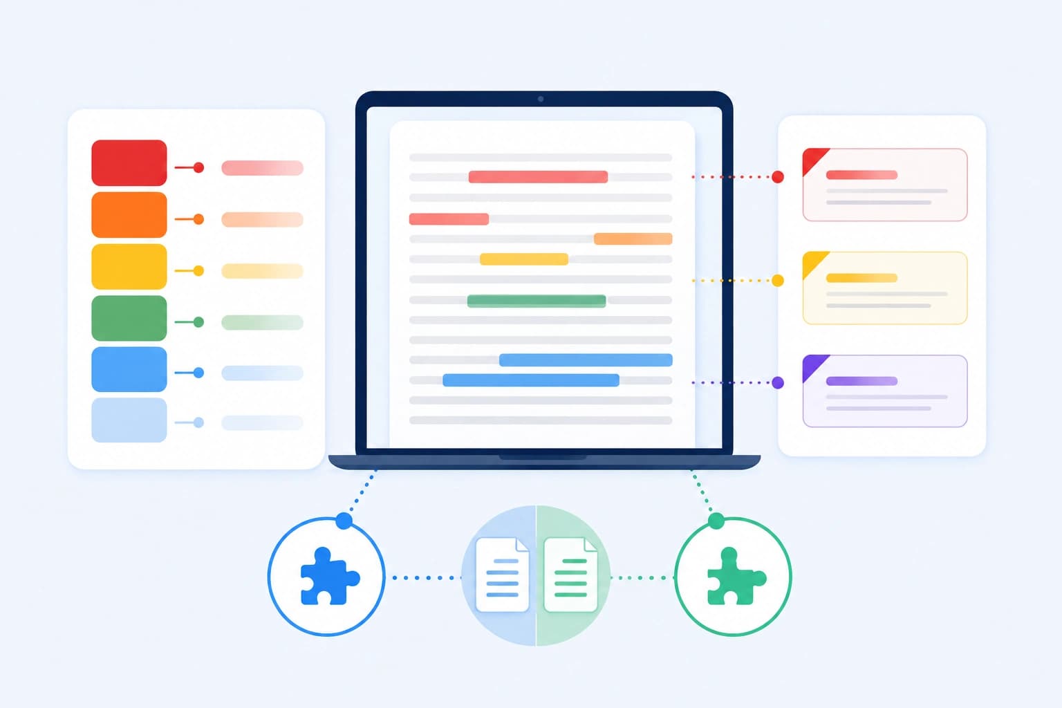
Once you open an actual Similarity Report, the color language changes entirely — and this is the part almost no other explainer covers. Matched passages inside the document are highlighted using a system organized around citation and quotation status, not percentage range:
- Not cited or quoted. Matching text with no citation and no quotation marks — the category most likely to warrant a closer look.
- Missing quotations. The text is cited to a source, but the match is close enough that it likely should have been placed in quotation marks.
- Missing citation. The text is formatted as a quotation, but has no citation pointing to where it came from.
- Cited and quoted. Both a citation and quotation marks are present — generally the least concerning category, since it reflects properly attributed material.
These four categories are a completely separate axis from the blue-through-red percentage bands. A paper can sit in the green percentage band overall while still having a small amount of text flagged as "not cited or quoted" inside the report — which is exactly why opening and reading the actual highlighted matches matters more than glancing at the summary color.
Why highlight colors also rotate by source
On top of the citation-status color system, Turnitin also uses a rotating set of highlight colors to visually distinguish between different matched sources within the same document. If your paper matches five different sources, each source's matched passages get a distinct color so a reviewer can tell at a glance which sentences came from which source, rather than seeing one undifferentiated block of highlighted text. Where a passage could match more than one source, Turnitin displays the source with the highest word-match count first.
Why none of this is a grade
It bears repeating clearly, since the word "color code" naturally invites comparison to a grading rubric: none of these colors are a grade, and Turnitin does not assign or endorse a pass/fail threshold tied to any of them. A red-banded submission built almost entirely from correctly quoted and cited material can be completely legitimate academic writing. A green or even blue-banded submission can still contain a small amount of genuinely uncited copying that a human reviewer would consider a real problem. The color is a triage signal for a human to investigate — as covered in more depth in our piece on what happens if Turnitin flags you — never an automatic verdict.
How to read your own report correctly
The color icon is a starting point, not a stopping point. A correct read of any Turnitin result works through three layers in order: first, note the percentage-band color and the actual number next to it; second, open the report and look at how the matched text is distributed — is it clustered or spread out, and does it match one dominant source or many; third, check the citation-status color of each significant match — is it properly quoted and cited, or genuinely unattributed. Skipping straight to "the icon was orange, so this is a problem" misses almost everything the report is actually designed to tell you.
The bottom line
Turnitin's colors operate on two separate levels: a percentage-band icon (blue through red) that summarizes how much text matched something, and a citation-status highlight system inside the report itself that distinguishes properly attributed matches from unattributed ones. Neither is a grade, the percentage-band scheme isn't guaranteed identical across every Turnitin product and integration, and the number next to the color always matters more than the color's name.
If you want to see your own real similarity report — colors, highlighted matches, and all — before you submit, you can check your reports through SimilarityAndAI, the same Turnitin engine your institution uses.
Frequently asked questions
What does each Turnitin color mean?
In Turnitin's most common color scheme: blue means 0% similarity (no matching text found), green means 1–24% (a low level of matching text), yellow means 25–49% (a moderate level), orange means 50–74% (a moderately high level), and red means 75–100% (a high level of matching text). This is the percentage-band color shown as an icon next to a submission, not a grade or a plagiarism verdict.
Is blue always 0% on Turnitin?
Not universally — this is the detail most guides skip. In some Turnitin integrations and product views, blue and green are swapped, with green representing 0% and blue covering the 1–24% band instead. The color scheme can vary depending on which Turnitin product or learning management system integration your institution uses. The safest approach is always to read the percentage number next to the color rather than relying on the color name alone.
Are the highlight colors inside my report the same as the color-band icon?
No — they're two entirely separate systems that happen to share the same visual language. The icon color (blue/green/yellow/orange/red) reflects your overall percentage band. Inside the actual report, matched passages are highlighted using a different color system based on citation and quotation status — not cited or quoted, missing quotations, missing citation, and cited and quoted — plus a rotating set of colors to distinguish between different matched sources.
Does a red or orange color mean I definitely plagiarized?
No. The color only reflects how much text matched something in Turnitin's databases — it says nothing about whether that matching text was properly quoted and cited. A red-banded paper built from extensive, correctly cited quotations can be entirely legitimate, while a blue or green paper can still contain a smaller amount of genuinely uncited copying. The color is a starting point for a human to review the actual matches, not a verdict.
Ready to check your paper?
Get your Turnitin reports in minutes.
Same reports your institution generates — delivered privately, fast.
Related articles
Turnitin Integrity Flags Explained: Replaced Characters, Hidden Text, and What They Actually Mean
9 min read · August 14, 2026